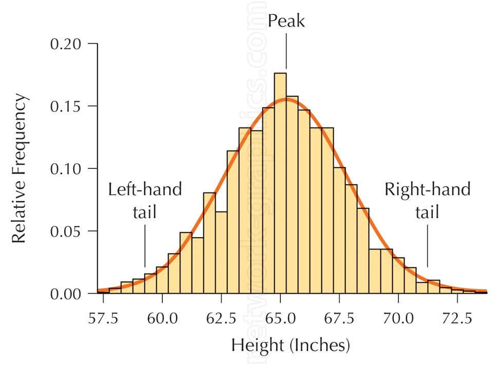
Statistical distribution curve fitted to bar chart data.

This graph illustrates a bell curve, commonly used in statistics textbooks to represent the distribution of data, in this case, the relative frequency of human heights. It demonstrates how data clusters around a central peak, with decreasing frequency as values move toward the tails.
We can provide sample images or create custom illustrations tailored to your projects. If you are looking for an illustration of this type, or from another subject area, you can contact us to discuss your needs.
Network Graphics / Division of Abramson & Wickham Graphics Inc.
All rights reserved.

