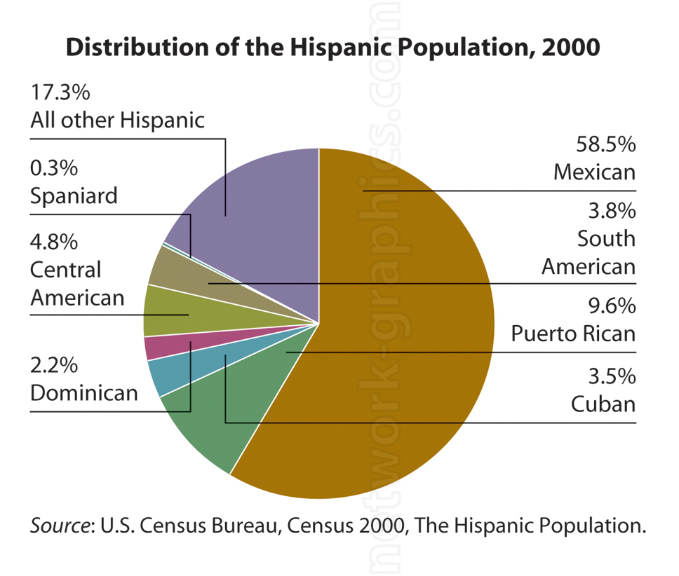
Distribution of the Hispanic Population in the U.S. (2000).

This pie chart represents the distribution of the Hispanic population in the United States as of the year 2000, based on U.S. Census Bureau data. It provides a breakdown by national origin, showing the predominance of Mexican heritage within the Hispanic community. This visualization is ideal for social studies or demography textbooks, aiding students in understanding the diversity within the Hispanic population.
We can provide sample images or create custom illustrations tailored to your projects. If you are looking for an illustration of this type, or from another subject area, you can contact us to discuss your needs.
Network Graphics / Division of Abramson & Wickham Graphics Inc.
All rights reserved.

